As an initial step for land cover classification, we need to identify and visualize the satellite image for the specified study area. The image is often used to assign training points visually. In this post, i will try to explain how to image Landsat 8 image for a selected study area.
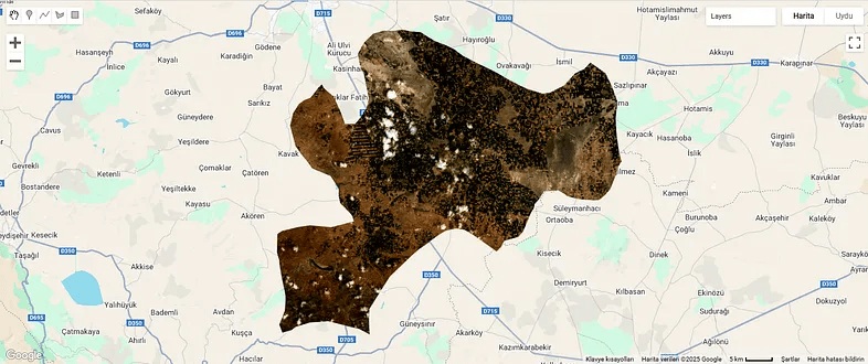
As a case study, we want to extract the land cover of Çumra district of Konya. To do this, we will first clip the satellite image according to the district borders. Global district border data is also available in Google Earth Engine. From here, we can extract the Çumra district border and clip the satellite image according to this border. First, let’s add the global district border data to the project.
// Load the FAO GAUL dataset for administrative boundaries (level 2 for districts)
var gaul = ee.FeatureCollection('FAO/GAUL/2015/level2');
Now let’s store the coordinates of the Çumra district center in a variable;
// Define the coordinates of Cumra district center (approx 37.57°N, 32.77°E)
var point = ee.Geometry.Point(32.77, 37.57);
There is one part we need to pay attention to here; when writing coordinate values in Google Earth Engine, we write the longitude value first and then the latitude value. Although some programs write latitude first and then longitude, this is the case in Google Earth Engine.
Now, we will use the point we assigned to extract the Çumra district border from the global district border data. In other words, we will extract the one that overlaps with this point from among all district borders. In this way, we will only have the Çumra district border.
// Filter the GAUL dataset to get the province containing the point
var cumraDistrict = gaul.filterBounds(point);
var cumraFeature = cumraDistrict.first();
Let’s print the name of the result data to verify the result we obtained.
// Print the province name to verify the selection
print('Selected district:', cumraFeature.get('ADM2_NAME'));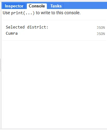
As we expected, the borders of Çumra district have been sorted out.
// Extract the geometry of the district (Cumra district boundary)
var cumraGeometry = cumraFeature.geometry();
I just mentioned that Landsat images are stored in Google Earth Engine. Among these images, we will first sort out the ones that overlap with the Çumra district border, then we will mosaic and finally we will clip them according to the Çumra district border. There is an issue here; in a situation where the district border passes tangentially through an image, this image may not be captured and in this case, a small part of the image we obtained for the Çumra district may be missing. In order to avoid such a deficiency, let’s draw a 10-kilometer buffer zone around the district border.
// Buffer the geometry (10 km) to ensure full image coverage
var bufferedGeometry = cumraGeometry.buffer(10000);
Let’s add the Landsat 8 imagery collection to the study.
// Load the Landsat 8 Collection 2 Level 2 Surface Reflectance dataset
var landsat = ee.ImageCollection('LANDSAT/LC08/C02/T1_L2');
Let’s filter the image collection so that only images from July 2024 remain.
// Filter the image collection by date (summer 2024) and buffered location
var summer2024 = landsat.filterDate('2024-07-01', '2024-07-31')
                       .filterBounds(bufferedGeometry);
In addition to adding the image to the study, we also want to learn the ‘path’ and ‘row’ values. You can think of Path and Row as values that represent the locations of Landsat images. These values are connected to Landsat’s Worldwide Reference System and create a fixed grid system. This part is optional but useful for learning the images corresponding to the Çumra district.
// Print the paths and rows to verify scene coverage
print('Paths in summer2024:', summer2024.aggregate_array('WRS_PATH').distinct());
print('Rows in summer2024:', summer2024.aggregate_array('WRS_ROW').distinct());
As you know, in multispectral images, different values are stored in different bands for each pixel. There are value differences between pixels, and the values of images taken at different times for the same pixel may vary. For example, the value in the red band of the image taken on July 8 and the red band of the image taken on July 24 may be different for the same pixel. The median function can take the median of different values corresponding to the same pixel. In this way, we fill the missing area in one image with the data in the other image. In this way, we can reduce the effect of the cloud and temporal variations and obtain a cleaner image.
// Create a median composite over the summer period to ensure full coverage
var composite = summer2024.median();
Now let’s clip the image we obtained according to the Çumra district border.
// Clip the composite image to the Cumra District boundary
var clippedComposite = composite.clip(cumraGeometry);
In Landsat Level 2 images, the reflectance values are multiplied by 10,000, so they take up less space. Therefore, to make the red, green and blue bands suitable for display, let’s bring the reflectance values between 0–1. To do this, we divide the pixel values of the relevant bands by 10,000.
// Scale the surface reflectance bands (divide by 10000 for reflectance values)
var visBands = clippedComposite.select(['SR_B4', 'SR_B3', 'SR_B2']).divide(10000);
When we run the code we want to see the image automatically;
// Center the map on the Cumra District geometry with a zoom level of 8
Map.centerObject(cumraGeometry, 8);
We chose a zoom level of 8. A higher value will give a more zoomed-in view when the map is first opened, a lower value will give the opposite. You can also try different values if you wish.
Now let’s write the code needed to add the image to the map.
// Add the clipped composite image to the map for visualization (true color)
Map.addLayer(visBands, {min: 0, max: 0.3}, '2024 Landsat Image');
The addLayer function is used to visualize the image.
With (min, max) argument, we set the display range. You can think of it like adjusting the brightness and contrast on a television. With these values, pixels with values less than 0 will be displayed as black, and pixels with values greater than 0.3 will be displayed as white.
Finally, we can enter the layer name we want, to represent the image.
In addition to the image, let’s add the Çumra district border polygon to the map.
// Add the district boundary to the map for reference
Map.addLayer(cumraGeometry, {color: 'red'}, 'Cumra District Boundary');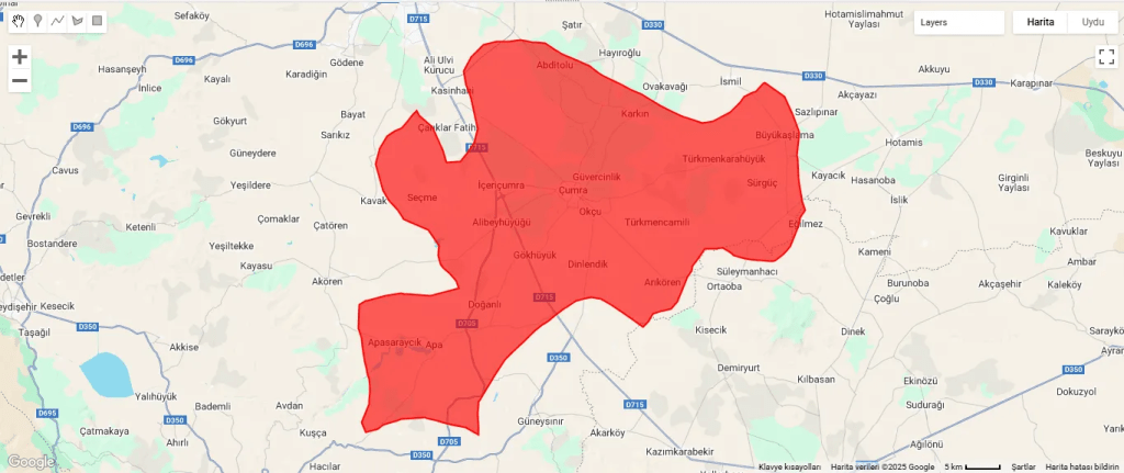
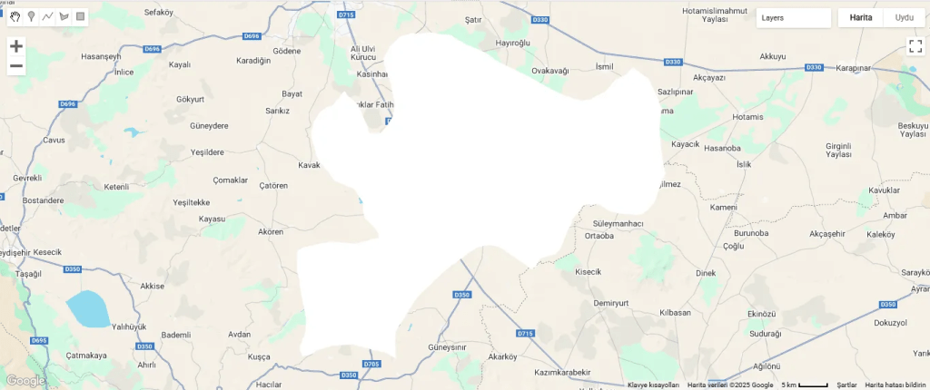
The boundary polygon and Landsat 8 imagery have been added to the map, but the image is completely white. This shows that the pixel values exceed 0.3. Or, we may have obtained this result because we did not use cloud masking; so we can use Landsat’s QA_PIXEL band to mask the clouds and shadows. This can be another post topic. If you wish, you can increase the maximum value and try again. Instead, let’s go to the layer settings and use one of the display settings there.
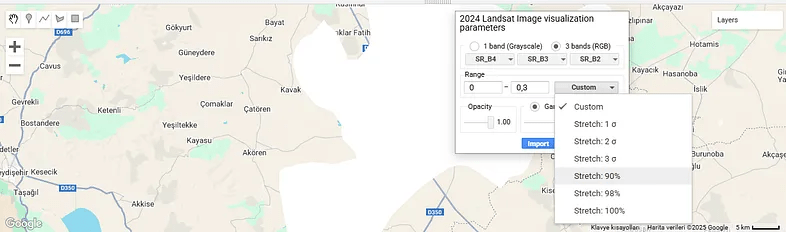
I have already explained the minimum and maximum values here. Apart from that, you can see the images assigned to the red, green and blue bands. “Opacity” determines how transparent or opaque the layer will be.
We click on the “Custom” option. There are different “Stretch” alternatives here. For example, the “Stretch: 90%” option leaves out the lowest 5% and the highest 5% of pixel values and displays the remaining values. The same logic applies for other different percentage values.
Apart from this, you can see sigma values in some options, which can be a bit confusing. Sigma refers to standard deviation. For example, the “2 Sigma” option takes the range of pixel values within two standard deviations around the mean, which is approximately 95%. Thus, it excludes very high or very low outliers and shows the image more balanced.
Let’s try the “Stretch: 90%” option.
It looks better now.
Finally, let’s make an optional addition. The maximum and minimum values we assigned to the image caused us to get a completely white result. So we want to learn the correct value range.
// Print the pixel value range to debug visualization issues
print('Pixel value range:', visBands.reduceRegion({
  reducer: ee.Reducer.minMax(),
  geometry: cumraGeometry,
  scale: 30,
  maxPixels: 1e9
}));
This code prints the pixel value range of the image. Accordingly, we can write the correct values during the visualization phase.
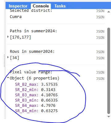
By the way, the values we found are much larger than the expected range, i.e. 0–1. This is probably due to the large number of clouds in the image.

Leave a comment