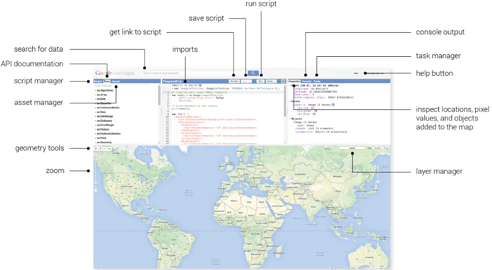
QuickOSM is a QGIS plugin designed to make it easy to download and integrate OpenStreetMap data. It utilizes the Overpass API for querying. As you probably already know, OSM is an invaluable resource for GIS tasks thanks to its vast repository of user-contributed mapping data. It includes features like streets, buildings, administrative boundaries etc. In this blog post, I will try to demonstrate how to download it based on the specified criteria, using QuickOSM plugin in QGIS.
First, we need to install it. We go to the Plugins menu and find the plugin.
Figure 1: You can find and download it in the Plugins menu
After you download it, you can directly access it via the “Vector” option in the top menu.
You can see the menu down below. There are several options here, but we select the “Quick Query” option to type our query.
Figure 2: The plugin windowFigure 3: “Quick Query” section of the plugin
We first select the keyword. I want to see “industrial” areas. After selecting “industrial” in the ‘Key’ section, I can query on a specific value. If I don’t select any value, it will query on all values.
If we want, we can type multiple queries, but as I observed, it can give wrong results.
Right below, I select a place to get the industrial areas. I want to see industrial areas in London, so I type the name there.
Figure 4: You can select different variables depending on your purpose
By clicking the “Advanced” option down below, we can define what type of data we want to see, in which format we want to save the data, and where we want to save it. I want to see polygons only. And I don’t want to save it now. Thus, I cannot change the format for now.
Figure 5: ‘Advanced’ section of the query window
When we click on “Run query” it will automatically download the features that suit the criteria we have defined. When it is completed, you can see the downloaded layer(s) in the layer window.
Figure 6: There is only one layer created in my case
It seems that there is only one polygon that suits the criteria I have defined. It, of course, may change depending on your specific criteria.
Figure 7: The port polygon located in London was downloaded by using QuickOSM plugin
You can play with this tool and see how easy it is to download OpenStreetMap data directly in QGIS.
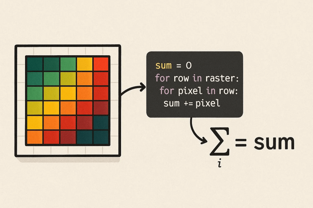
When you are working with raster data (e.g., digital terrain models), you may need to do several mathematical calculations using the pixel values, depending on your purpose. In this post, I am going to demonstrate how to sum all the pixel values in a digital surface model using Python.
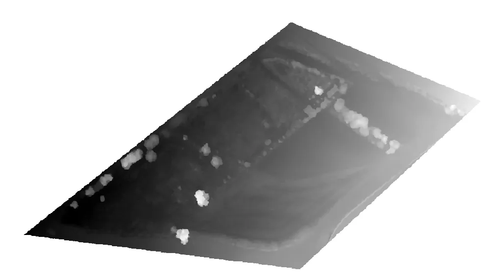
I will use a Digital Surface Model for demonstration. It has height values in meters.
Figure 1: The digital surface model
import rasterio
import numpy as np
rasterio: Used to read and process geographic data files (raster data) such as TIFF. This library is especially common in remote sensing and GIS applications.
NumPy: Used for numerical calculations. Required to process pixel values as an array and perform mathematical operations such as addition.
Without these libraries, we cannot read a TIFF file or perform calculations on pixel values. Rasterio is usually installed in the Colab environment, but if not, it can be installed with !pip install rasterio.
This code defines the location in Google Drive of the TIFF file to be processed. Google Colab can work integrated with Google Drive. /content/drive/My Drive/ is the root directory of Google Drive. Data/difference.tif points to the “difference.tif” file located in the “Data” folder in Drive.
We need to make sure the file is in TIFF format. Any other format (for example, PNG or JPEG) cannot be read directly with rasterio.
Let’s read the data and sum the pixel values;
# Read TIFF file and calculate sum of pixel values with rasterio.open(file_path) as src: # Read the first band data = src.read(1, masked=True) # Get the no-data value nodata = src.nodata if src.nodata is not None else None
# Calculate the sum of valid pixel values only if valid_data.count() > 0: # If there is valid data total_sum = valid_data.sum() print(f"Sum of valid pixel values: {total_sum}") print(f"Number of valid pixels: {valid_data.count()}") else: print("Error: Valid pixel value not found.")
with rasterio.open(file_path) as src: Opens the TIFF file and creates a context manager to read its contents.
rasterio.open(file_path) opens the file in read mode and returns a rasterio.DatasetReader object (src).
The with statement allows file operations to be performed safely. The file is automatically closed when the operation is completed, which prevents memory leaks.
This step provides access to the contents of the file (pixel data, metadata).
data = src.read(1, masked=True): Reads the first band (channel) of a TIFF file and masks the no-data values.
What is a band?: TIFF files can contain multiple layers of data (bands). For example, in a satellite image, red, green, and blue colors might be separate bands. src.read(1) reads the first band.
masked=True enables no-data values (if defined in the file) to be marked as a NumPy MaskedArray. This ensures that no-data pixels are ignored during calculation.
data is a NumPy MaskedArray containing pixel values. Each pixel is a numeric value (for example, of type float32 or int16) at a location in the image.
If our file contains more than one band and the wrong band is read, you may get unexpected results. To check the number of band:
print(src.count)
If masked=True is not used, no-data values (for example, -9999) are read as raw values and may affect the total.
nodata = src.nodata if src.nodata is not None else None: Retrieves the no-data value (if any) from the TIFF file’s metadata.
What is a no-data value?: TIFF files can define a no-data value to represent invalid or missing data (for example, -9999 or 0).
src.nodata returns the no-data value defined in the file’s metadata. If not defined, None is returned.
The presence of the no-data value is checked with src.nodata is not None. Otherwise, the nodata variable is None.
Why it matters: Handling no-data values correctly prevents incorrect totals from being calculated. For example, areas covered by clouds in a satellite image might be marked as no-data.
if nodata is not None (and else): Keeps only valid pixel values, masking no-data values or invalid values (NaN, inf, -inf).
np.ma.masked_equal(data, nodata) masks pixels in the data array that are equal to the nodata value. For example, if the no-data value is -9999, pixels with this value are excluded from the calculation.
np.ma.masked_invalid(data) masks invalid values such as NaN (non-numeric), inf (infinity), and -inf (negative infinity). This prevents errors (for example, overflows or undefined values) that are particularly common with float data types.
What is MaskedArray?: NumPy’s MaskedArray class allows certain values to be excluded from calculations. Masked pixels are ignored in operations such as summing or averaging.
if valid_data.count() > 0: Checks the number of unmasked (valid) pixels.
valid_data.count() returns the number of unmasked (valid) pixels in the MaskedArray. If there is at least one valid pixel, the addition is performed. Otherwise, an error message is printed. This is important because if all pixels are masked (for example, all no-data or NaN), the summation operation becomes meaningless. This check prevents working with an empty data set.
total_sum = valid_data.sum(): Calculates the sum of the current pixel values.
Let’s run the code.
Figure 2: My result values
We need to interpret the sum of valid pixel values and number of pixels by considering the unit (of the pixel values) and spatial resolution. My height values are in meters and my spatial resolution is 2.7 cm. This makes it understand for me to understand what do these result values mean.
Let’s say that we want to eliminate specific pixel when we do an addition operation. For example, let’s assume that we need to exclude the pixels with the value of something between 0 and -1 or 0 and +1. Then the code should be like this;
# Import required libraries import rasterio import numpy as np
# Specify the path to the TIFF file file_path = '/content/drive/My Drive/Data/difference.tif'
# Read TIFF file and filter pixel values with rasterio.open(file_path) as src: # Read the first band, mask the no-data values data = src.read(1, masked=True) # Get the no-data value nodata = src.nodata if src.nodata is not None else None
# Mask invalid values (NaN, inf, -inf) if nodata is not None: valid_data = np.ma.masked_equal(data, nodata) else: valid_data = np.ma.masked_invalid(data)
# Calculate the sum of the remaining valid pixel values if filtered_data.count() > 0: total_sum = filtered_data.sum() print(f"The sum of the remaining pixel values is: {total_sum}") print(f"Number of valid pixels remaining: {filtered_data.count()}") else: print("Error: No valid filtered pixel value found.")
This is very similar to the previous code. The only difference is the code section that starts with # Eliminate values in the range [0, +1] and [0, -1]. This eliminates pixel values in the range [0, +1] and [0, -1].
valid_data > -1) & (valid_data < 0) selects values in the range -1 < x < 0
(valid_data > 0) & (valid_data < 1) selects values in the range 0 < x < 1
|: The logical OR operator combines these two ranges.
np.ma.masked_where(condition, valid_data) masks pixels that meet the specified condition. That is, pixels where -1 < x < 0 or 0 < x < 1 are excluded from the calculation.
Figure 3: My result value is almost half of the previous one.
Land use/land cover maps are used in many areas, such as climate change, natural resource management, and urban/regional planning, and the accuracy of these maps is of critical importance. The OpenStreetMap project has been ongoing since 2004 and provides free geographic and thematic data on a global scale with the help of millions of volunteers. With OpenStreetMap, everyone can contribute to data production, and there is no minimum mapping unit (MMU) in the data produced. However, you can see how spatial resolution affects the accuracy of our analyses in raster data we obtain from other sources. Therefore, we can say that OSM data provides more detailed results in land cover/land use mapping.
However, it is possible to say that there are errors in OSM data. Incorrect thematic information, overlapping features, and temporal and spatial inhomogeneity limit the reliability of OSM data in land cover mapping. OSM data is not comprehensive enough on a global scale. There is a lack of data in some regions.
Schultz et al. (2017) aimed to address this deficiency by using land cover data obtained from open-access satellite images. In this way, it would be possible to produce a highly accurate land cover/land use map on a global scale.
Figure 1: Workflow of the mentioned study (Source: the paper)
Making a Basic Land Cover Map with OpenStreetMap (OSM)
In OSM, areas or objects are described using tags, which are labels that explain what something is. For example, a tag might say “landuse=forest” to mark an area as a forest or “natural=water” for a lake. The researchers focused on using OSM’s tags to assign land cover categories based on a standard system called Corine Land Cover (CLC), which organizes land into 44 classes (e.g., urban fabric, arable land, forests) across three levels of detail. In this study, they used CLC’s level 2, which has 15 broader categories, to make things manageable.
The OSM database (i.e., table) called “naturals” contains information about natural features and land use. Among the features, polygons are best for mapping land cover.
Polygons with tags related to land cover and land use can include but not limited to,
landuse (e.g., landuse=forest, landuse=farmland)
leisure (e.g., leisure=park)
natural (e.g., natural=water, natural=grassland)
tourism (e.g., tourism=camp_site)
waterway (e.g., waterway=riverbank)
By writing an SQL query, it is possible to pull out all relevant polygons from the “naturals” table. This can give us a dataset of tagged areas across the globe. But they specifically focused on Heidelberg, Germany, for their case study.
One of the biggest differences between OSM and CORINE land cover data is that OSM can capture both small and large areas, unlike CLC, which has a minimum mapping unit of 25 hectares.
OSM tags were taken and linked to the CLC level 2 classification system to create a land cover map that could be compared to CLC’s 2012 map. A legend harmonization table shows which OSM tags correspond to which CLC classes. For example:
CLC Class 1.1 (Urban fabric) was matched to OSM tag “residential.”
CLC Class 2.1 (Arable land) was matched to OSM tags like “farmland,” “farm,” “greenhouse,” and “horticulture.”
CLC Class 3.1 (Forests) was matched to OSM tags “forest” and “wood.”
CLC Class 5.0 (Water bodies) was matched to OSM tags like “water,” “riverbank,” “reservoir,” and “canal.”
However, not every CLC class had a direct OSM tag match. For example, CLC classes like “Artificial non-agricultural vegetated areas” (1.4) or “Heterogeneous agricultural areas” (2.4) do not have clear OSM equivalents. Also, OSM tags can be inconsistent because volunteers might use different tags for similar things (e.g., “wood” vs. “forest”).
After this step, the tagged OSM data can be turned into a map that shows land cover categories based on the CLC system. But this creates a “fractional” map, meaning it only coveres areas where OSM tags were available, leaving gaps where tags were missing.
Filling the Gaps with Satellite Data
Remote sensing means collecting information about the Earth from a distance, usually using satellites that take pictures from space. These pictures (images) show details like forests, cities, or water bodies based on how the land reflects light. It is possible to fill the gaps in the OSM data with the remotely sensed data.
Landsat imagery, thanks to its high temporal resolution, can be effectively used to fill the gaps in the OSM data since it can easily match the different timestamps of the OSM tags. They used a technique called supervised non-parametric classification to figure out the land cover in the gaps. But what does supervised non-parametric mean?
Supervised: Training a computer to recognize land cover types by showing it examples. In this case, the examples come from the OSM tags.
Non-parametric: This means the method doesn’t assume the data follows a specific pattern (like a bell curve). It’s flexible and works well for complex landscapes.
Classification: The computer assigns a land cover category (based on the Corine Land Cover system) to each pixel in the satellite images for the gap areas.
The result of this operation is a continuous coverage Open Land Cover map. There are challenges that we may face during classification; clouds might block the view in the satellite images, or different seasons might change how land looks. Thus, pre-processing is necessary before classifying the images. In addition, matching satellite patterns to Corine Land Cover classes requires careful training to avoid mistakes.
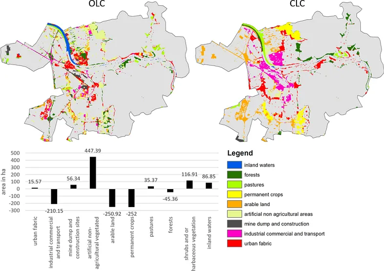
Figure 2: OLC vs CLC difference, colored areas show products differences and grey areas show agreement (84% of total area), bottom table provided area disagreement numbers OLC — CLC. (Source: The paper)
Checking How Good the Map Is
It is necessary to know how accurate the result Open Land Cover map was and whether it was better than the Corine Land Cover map. The researchers used stratified random sampling and several accuracy metrics to evaluate the maps. The results show that OLC map was 87% accurate, while CLC map was 81% accurate, so OLC performed better by 6%. The two maps agreed on land cover for 84% of the study area, meaning they were similar in most places, but Open Land Cover was more detailed, especially in areas with mixed land cover.
Conclusion
OSM’s volunteer contributions made the Open Land Cover flexible and up-to-date, and there are no restrictions on mapping unit or content. Also, using free satellite data and OSM together made the method affordable and accessible. The 87% accuracy (and better performance than CORINE) showed the method’s reliability for applications like urban planning or climate modeling. However, OLC’s tags came from different times, while CLC was all from 2012. This can make comparisons tricky since land cover may change with time. Also, some classes, like “Pastures” and “Shrub/herbaceous vegetation,” are confused, and this reduces accuracy. As an alternative, it is possible to aggregate these classes, but this would reduce detail. Finally, the method provided satisfying accuracy for the selected study area, but the number of OSM tags can be much less in other areas, so the accuracy can significantly decrease.
Land use changes, which mostly occur due to anthropogenic effects in urban areas, cause many problems such as urban heat islands and floods. In combating these problems, data on impervious surfaces and green spaces, which are two important components of urban areas, play a critical role. Some datasets such as CORINE Land Cover, Urban Atlas Dataset, Trust for Public Land’s ParkServe Dataset include these data. However, these datasets are not sufficient in terms of resolution and/or completeness. Kuang et al. (2021) prepared a global dataset showing impervious surfaces and green areas as an alternative to these datasets. The methodology used in this study is as follows;
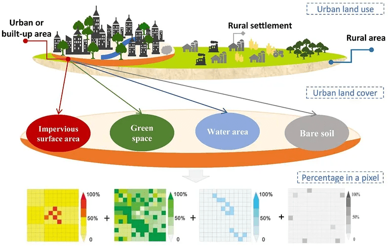
Basically, the researchers want to map two main parts of cities:
Impervious Surface Area (ISA): Areas like concrete roads, buildings, and parking lots that don’t let water soak into the ground.
Green Space (GS): Areas with vegetation, like trees, grass, or gardens.
The Big Idea: Hierarchical Architecture Principle and Subpixel Method
In the study, it is assumed that urban areas consist mainly of impervious surfaces, green spaces, water surfaces and bare soils. However, satellite images with medium spatial resolution such as Landsat can show more than one land cover type in the same pixel. For this reason, the study proposes the sub-pixel method. With this method, the percentage of each relevant land cover type in each Landsat pixel is calculated. For this, very high resolution images are used. After some of the pixels are trained in this way, the land use rates in other pixels can also be estimated using Machine Learning.
Figure 1: The hierarchical scale principle and subpixel metric method (Source: the paper)
However, when doing this in global scale, it is necessary to analyze similar patterns separately to be able to get more accurate results. Thus, global terrestrial surface was divided into 15 ecoregions and these were analyzed separately.
Mapping Impervious Surface Areas
Impervious surfaces are human-made surfaces that don’t let water soak into the ground, like roads, buildings, parking lots, and sidewalks. Mapping ISA means figuring out how much of each 30m x 30m piece (pixel) of a city is covered by these surfaces, expressed as a percentage (e.g., 70% concrete). This is important for understanding urban growth, managing floods (since water runs off ISA), and planning greener cities.
The foundation for ISA mapping is the Normalized Settlement Density Index (NSDI), which estimates the percentage of impervious surfaces in each pixel. They calculate NSDI, a number from 0 to 1 (e.g., 0.7 = 70% concrete), for every 30m pixel globally. They did this by following data sources;
Data Sources:
• Landsat 8 OLI images (30m resolution): Provide detailed views of land cover.
• SRTM Digital Elevation Model (DEM): Shows terrain to account for hills or flat land.
• DMSP/OLS Nighttime Lights: Highlights urban areas that glow at night.
• Global Surface Water: Excludes water bodies to avoid confusion with concrete.
• Enhanced Bare Soil Index (EBSI): Separates bare soil from ISA, especially in dry areas.
The researchers selected 300 random points in urban areas from 57 cities across 15 regions and they created 90m x 90m grids around each. By using Google Earth (0.6m) and Gaofen-2 (GF-2) (1m/4m) images, they manually marked impervious surfaces (roads, buildings) in each grid, calculating the ISA percentage (e.g., 60% concrete).
Figure 2: (a) Spatial distribution of the sample points (b) digitized proportions of the impervious (pink) and vegetation (green) areas. (Source: the paper)
They feed the data (Landsat bands, DEM, nighttime lights, etc.) and training samples into the Random Forest algorithm on Google Earth Engine. RF learns patterns (e.g., “Bright, non-green areas with lights are concrete”) and predicts the ISA percentage (NSDI) for every pixel. They chose RF because it is more accurate than other methods like support vector machines for urban mapping.
Retrieval of Urban-Rural Boundaries
The researchers used the Normalized Settlement Density Index (NSDI), which shows how much concrete is in each 30m x 30m pixel (e.g., NSDI = 0.7 means 70% concrete) to identify urban-rural boundaries. By setting a threshold for NSDI, they decide which pixels are urban (lots of concrete) vs. rural (less concrete). They also refined these boundaries to make them accurate and smooth. They decided what NSDI value marks a pixel as “urban.” A higher NSDI means more concrete, so urban areas have higher NSDI than rural ones. But cities look different around the world (e.g., dense in Africa, sprawling in the USA), so it is necessary to use different thresholds for different regions.
They tested NSDI thresholds from 25% to 60% (in 5% steps, e.g., 25%, 30%, 35%) in 57 sample cities across the 15 ecoregions and for each city, they check how accurate the boundary is by using Overall Accuracy and Kappa Coefficient. They picked the best threshold values for each region based on the accuracy assessment results.
They converted the NSDI map from raster to a “vector” format (shapes or polygons) where pixels with NSDI above the threshold are grouped into urban areas. For example, in Africa, all pixels with NSDI ≥ 0.35 are marked urban and connected to form a city shape. Some urban areas have “holes” (pixels with low NSDI, like a park inside a city). They filled these holes to create smooth, solid urban regions.
Finally, they double-checked the boundaries by hand to fix mistakes.
Mapping Green Spaces
FVC is a way to measure how green a pixel is based on NDVI. To calculate FVC, this formula was used;
FVC = (NDVI of the pixel — NDVI of bare soil) / (NDVI of pure vegetation — NDVI of bare soil)
• NDVI of the pixel: How green this specific pixel is (from satellite data).
• NDVI of bare soil: How green a place with no plants is (like a desert).
• NDVI of pure vegetation: How green a place with only plants is (like a forest).
Later, Normalized Green Space Index was calculated by multiplying FVC values with β. β is a correction factor they calculate for each region (e.g., North America or Africa) to make sure the greenery percentage is accurate. Think of β as a knob you tweak to adjust the “greenness” measurement so it matches the real world, because plants look different in different places (e.g., a desert vs. a rainforest).
FVC is calculated using the Normalized Difference Vegetation Index (NDVI), which measures how much plants reflect light. But FVC isn’t perfect — it’s like a rough guess of how much greenery is in a pixel. Different regions (e.g., North America, Africa, or Asia) have different types of plants, climates, or soils, which can make FVC over- or underestimate the actual green space.
For example:
• In a lush forest city, FVC might say 50% greenery, but the real green space is 60%. β boosts the number.
• In a dry desert city, FVC might overestimate greenery because sparse plants look greener than they are. β lowers the number.
The researchers compared the FVC (rough guess) to the actual green space percentage in the training data (which they digitized and calculated fractions). For example, FVC might say 40% greenery, but the sample shows 48%.
They plotted FVC against the actual green space percentages from the samples. This creates a graph where:
• X-axis: FVC values (e.g., 0.4, 0.5).
• Y-axis: Actual green space percentages (e.g., 48%, 60%).
• They draw a line of best fit through the points. The slope of this line is β.
It’s a number that shows how much FVC needs to be scaled to match the real green space. If β = 1.2, it means FVC is too low, so you multiply FVC by 1.2 to get the right number. If β = 0.8, FVC is too high, so you reduce it. For each ecoregion, they used the sample cities in that region to find the best β. For example:
• In a tropical ecoregion with dense jungles, β might be higher because FVC underestimates thick vegetation.
• In a desert ecoregion with sparse shrubs, β might be lower because FVC overestimates greenery.
Once they have β for an ecoregion, they multiply the FVC of every pixel in that region by β to get the final NGSI.
Figure 3: Spatial distribution of global ISA (a1) and GS (a2) (Source: the paper)
Conclusion
As a result of the accuracy assessment of the results, produced within the scope of the study, it was stated that they have high accuracy (>90%). Since most of the studies in the literature focus on specific cities and regions, the production of impervious surface and green space maps on a global scale is quite important. However, the need for very high-resolution satellite images may limit the applicability of the study. The maps produced as a result of the study can be used as input maps in environmental, climate and urban planning studies and can be quite useful.
One of the most important data processing steps in GIS works is defining/changing coordinate system. It is crucial to get accurate results from our analysis. In this post, I will try to explain how to do it in QGIS with details.
Change Coordinate System of the Project
We first need to change the coordinate system of the project we work on (if we wish). You can see coordinate system information on the right bottom of the project page.
Fig. 1: Left click on it to see other optionsFig. 2: You can search and select the one you are looking for on this window
I will select WGS 84 UTM Zone 35N now for the sake of the data i will use.
Define Coordinate System for the Data
Let’s upload the data we are going to use to the project;
Fig. 3: This is how my data looks on the map
If the data does not have any defined coordinate system, you will get a warning on the top of the page, indicating “undefined CRS”. You can proceed with that warning and defined the CRS you are going to work on.
Change Coordinate System of the Data
We need to right click on the data on Layer Panel and select Properties -> Source to see coordinate system information.
Fig. 4: You can see the assigned coordinate reference system on this window
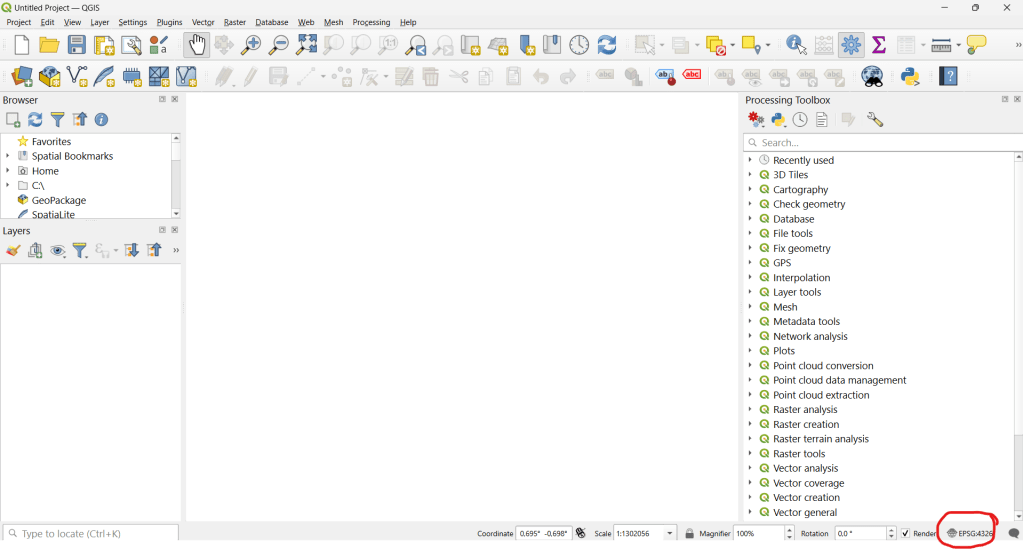
It is possible to change the coordinate system of that data on this window. However, this only redefines how QGIS interprets the layer’s coordinates. Coordinate values do not change so It does not reproject the actual data. To permanently reproject a layer, we need to use Reproject tool
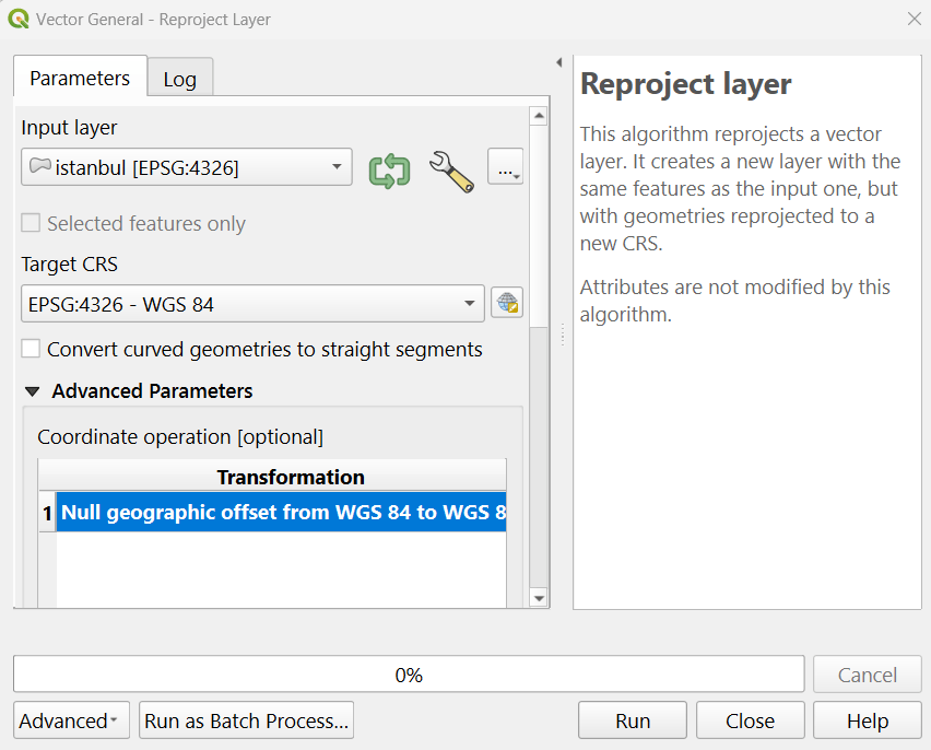
To reproject the data, you can go to top menu and click Vector -> Data Management Tools -> Reproject Layer
Fig. 5: You can select the target CRS on this window and run the tool
When you run the tool, a new layer with the defined coordinate system will be created and appear on the layer panel;
Fig. 6: New layer can now be seen on the layer panel and can be used for the analysis
As an initial step for land cover classification, we need to identify and visualize the satellite image for the specified study area. The image is often used to assign training points visually. In this post, i will try to explain how to image Landsat 8 image for a selected study area.
As a case study, we want to extract the land cover of Çumra district of Konya. To do this, we will first clip the satellite image according to the district borders. Global district border data is also available in Google Earth Engine. From here, we can extract the Çumra district border and clip the satellite image according to this border. First, let’s add the global district border data to the project.
// Load the FAO GAUL dataset for administrative boundaries (level 2 for districts)
var gaul = ee.FeatureCollection('FAO/GAUL/2015/level2');
Now let’s store the coordinates of the Çumra district center in a variable;
// Define the coordinates of Cumra district center (approx 37.57°N, 32.77°E)
var point = ee.Geometry.Point(32.77, 37.57);
There is one part we need to pay attention to here; when writing coordinate values in Google Earth Engine, we write the longitude value first and then the latitude value. Although some programs write latitude first and then longitude, this is the case in Google Earth Engine.
Now, we will use the point we assigned to extract the Çumra district border from the global district border data. In other words, we will extract the one that overlaps with this point from among all district borders. In this way, we will only have the Çumra district border.
// Filter the GAUL dataset to get the province containing the point
var cumraDistrict = gaul.filterBounds(point);
var cumraFeature = cumraDistrict.first();
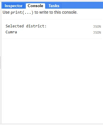
Let’s print the name of the result data to verify the result we obtained.
// Print the province name to verify the selection
print('Selected district:', cumraFeature.get('ADM2_NAME'));
Fig. 1: We have selected Çumra district
As we expected, the borders of Çumra district have been sorted out.
// Extract the geometry of the district (Cumra district boundary)
var cumraGeometry = cumraFeature.geometry();
I just mentioned that Landsat images are stored in Google Earth Engine. Among these images, we will first sort out the ones that overlap with the Çumra district border, then we will mosaic and finally we will clip them according to the Çumra district border. There is an issue here; in a situation where the district border passes tangentially through an image, this image may not be captured and in this case, a small part of the image we obtained for the Çumra district may be missing. In order to avoid such a deficiency, let’s draw a 10-kilometer buffer zone around the district border.
// Buffer the geometry (10 km) to ensure full image coverage
var bufferedGeometry = cumraGeometry.buffer(10000);
Let’s add the Landsat 8 imagery collection to the study.
// Load the Landsat 8 Collection 2 Level 2 Surface Reflectance dataset
var landsat = ee.ImageCollection('LANDSAT/LC08/C02/T1_L2');
Let’s filter the image collection so that only images from July 2024 remain.
// Filter the image collection by date (summer 2024) and buffered location
var summer2024 = landsat.filterDate('2024-07-01', '2024-07-31')
                       .filterBounds(bufferedGeometry);
In addition to adding the image to the study, we also want to learn the ‘path’ and ‘row’ values. You can think of Path and Row as values that represent the locations of Landsat images. These values are connected to Landsat’s Worldwide Reference System and create a fixed grid system. This part is optional but useful for learning the images corresponding to the Çumra district.
// Print the paths and rows to verify scene coverage
print('Paths in summer2024:', summer2024.aggregate_array('WRS_PATH').distinct());
print('Rows in summer2024:', summer2024.aggregate_array('WRS_ROW').distinct());
Fig. 2: We have printed paths and the row
As you know, in multispectral images, different values are stored in different bands for each pixel. There are value differences between pixels, and the values of images taken at different times for the same pixel may vary. For example, the value in the red band of the image taken on July 8 and the red band of the image taken on July 24 may be different for the same pixel. The median function can take the median of different values corresponding to the same pixel. In this way, we fill the missing area in one image with the data in the other image. In this way, we can reduce the effect of the cloud and temporal variations and obtain a cleaner image.
// Create a median composite over the summer period to ensure full coverage
var composite = summer2024.median();
Now let’s clip the image we obtained according to the Çumra district border.
// Clip the composite image to the Cumra District boundary var clippedComposite = composite.clip(cumraGeometry);
In Landsat Level 2 images, the reflectance values are multiplied by 10,000, so they take up less space. Therefore, to make the red, green and blue bands suitable for display, let’s bring the reflectance values between 0–1. To do this, we divide the pixel values of the relevant bands by 10,000.
// Scale the surface reflectance bands (divide by 10000 for reflectance values)
var visBands = clippedComposite.select(['SR_B4', 'SR_B3', 'SR_B2']).divide(10000);
When we run the code we want to see the image automatically;
// Center the map on the Cumra District geometry with a zoom level of 8
Map.centerObject(cumraGeometry, 8);
We chose a zoom level of 8. A higher value will give a more zoomed-in view when the map is first opened, a lower value will give the opposite. You can also try different values if you wish.
Now let’s write the code needed to add the image to the map.
// Add the clipped composite image to the map for visualization (true color)
Map.addLayer(visBands, {min: 0, max: 0.3}, '2024 Landsat Image');
The addLayer function is used to visualize the image.
With (min, max) argument, we set the display range. You can think of it like adjusting the brightness and contrast on a television. With these values, pixels with values less than 0 will be displayed as black, and pixels with values greater than 0.3 will be displayed as white.
Finally, we can enter the layer name we want, to represent the image.
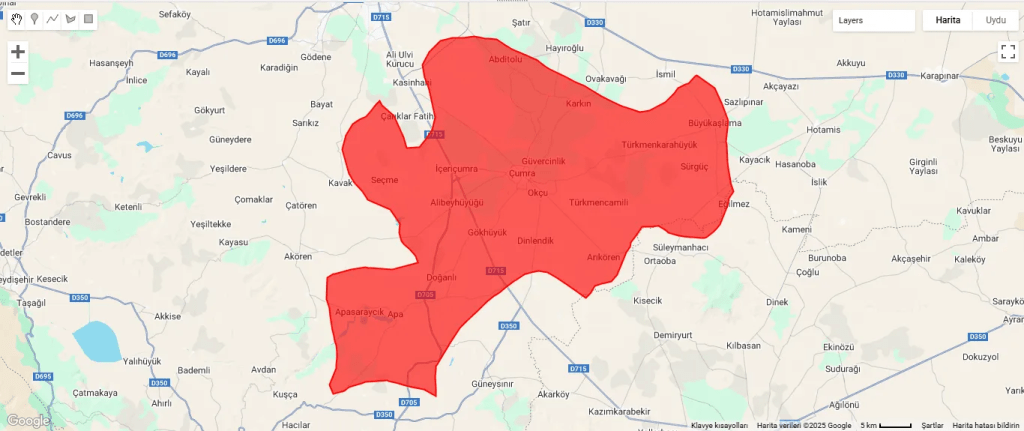
In addition to the image, let’s add the Çumra district border polygon to the map.
// Add the district boundary to the map for reference
Map.addLayer(cumraGeometry, {color: 'red'}, 'Cumra District Boundary');
Fig. 3: Çumra district border polygonFig. 4: The image is appearing as white
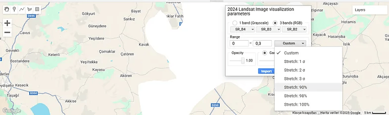
The boundary polygon and Landsat 8 imagery have been added to the map, but the image is completely white. This shows that the pixel values exceed 0.3. Or, we may have obtained this result because we did not use cloud masking; so we can use Landsat’s QA_PIXEL band to mask the clouds and shadows. This can be another post topic. If you wish, you can increase the maximum value and try again. Instead, let’s go to the layer settings and use one of the display settings there.
Fig. 5: We click on layer settings to see this window
I have already explained the minimum and maximum values here. Apart from that, you can see the images assigned to the red, green and blue bands. “Opacity” determines how transparent or opaque the layer will be.
We click on the “Custom” option. There are different “Stretch” alternatives here. For example, the “Stretch: 90%” option leaves out the lowest 5% and the highest 5% of pixel values and displays the remaining values. The same logic applies for other different percentage values.
Apart from this, you can see sigma values in some options, which can be a bit confusing. Sigma refers to standard deviation. For example, the “2 Sigma” option takes the range of pixel values within two standard deviations around the mean, which is approximately 95%. Thus, it excludes very high or very low outliers and shows the image more balanced.
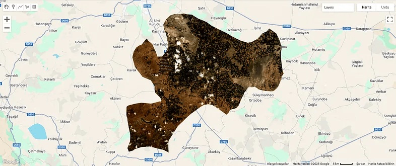
Let’s try the “Stretch: 90%” option.
Fig. 6: We selected “Stretch: %90”
It looks better now.
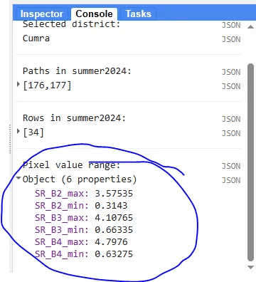
Finally, let’s make an optional addition. The maximum and minimum values we assigned to the image caused us to get a completely white result. So we want to learn the correct value range.
// Print the pixel value range to debug visualization issues
print('Pixel value range:', visBands.reduceRegion({
  reducer: ee.Reducer.minMax(),
  geometry: cumraGeometry,
  scale: 30,
  maxPixels: 1e9
}));
This code prints the pixel value range of the image. Accordingly, we can write the correct values during the visualization phase.
Fig. 7: Band range values
By the way, the values we found are much larger than the expected range, i.e. 0–1. This is probably due to the large number of clouds in the image.
Understanding what covers the Earth’s surface—such as forests, cities, water, or farmland—is essential for many purposes. This process, called land cover classification, is an important tool for studying the environment, managing resources, and predicting changes like shifts in climate. It is valuable for tasks such as planning cities and forecasting weather. Accurate land cover information improves the quality of other studies, making it a highly useful resource. Advances in technology, particularly remote sensing and platforms like Google Earth Engine (GEE), have made creating these maps quicker, more precise, and available to more people. This article explains how remote sensing helps with land cover classification, the advantages of GEE, and the role of computer tools in this work.
What Is Remote Sensing?
Remote sensing is a method of gathering information about the Earth’s surface from a distance, most often using satellites. These satellites capture images of the land, which help scientists identify what is present, such as trees or buildings. A key system for this is Landsat, which provides detailed pictures showing areas as small as 30 meters—about the size of a small park. Landsat satellites take new images every 16 days (or every 8 days with two satellites) and have been doing so for more than 30 years. This makes them excellent for observing changes over time, such as forests shrinking or cities growing.
Remote sensing allows us to examine large areas and track how land use changes. For example, it shows how human actions, like cutting trees or constructing roads, affect nature. These changes can influence animals, water systems, and weather patterns. However, mapping vast regions is challenging due to issues like clouds blocking the view and the large amount of data to process.
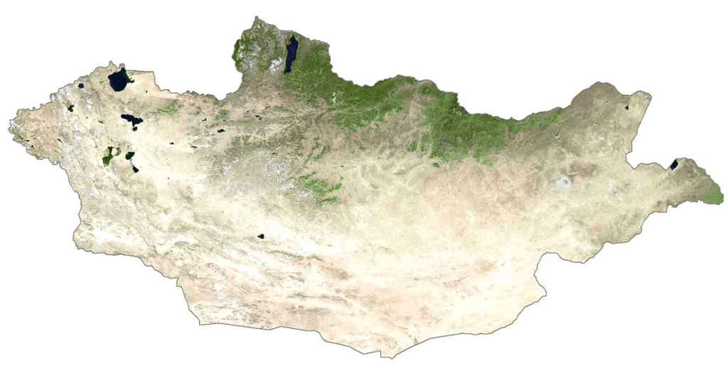
Mapping a whole country, such as Mongolia, requires many satellite images. For Mongolia, at least 125 Landsat images are needed. To make one clear map without clouds or snow, more than 800 images might be necessary. In the past, scientists had to collect, combine, and prepare these images, which took much time and needed strong computers. Clouds and snow often hide the land, making it difficult to get clear pictures.
These problems are sometimes called “big data” issues because there is so much information to manage. Ordinary computers struggle with this task, and extra steps—like removing clouds from images—add to the difficulty. Thankfully, new technology offers solutions to these problems.
Figure 2: Satellite view of Mongolia (Source: GISGeography)
Google Earth Engine: A Transformative Platform
Google Earth Engine (GEE) is a free online platform that simplifies working with satellite images. It allows users to access and study huge amounts of data without needing powerful personal computers. With GEE, people can select, clean, and analyze images directly on the internet. This makes it ideal for mapping large areas, such as countries or continents.
GEE is helpful in many areas, including farming, forestry, and city planning. It saves time since users do not need to download or store images themselves. For land cover mapping, GEE supports advanced computer programs that classify land quickly and accurately. Whether studying forest loss or city expansion, GEE makes it possible to work on a large scale.
The Merits of the Random Forest Classifier
To create maps from satellite images, scientists use computer programs called classifiers. One of the most effective is Random Forest (RF). RF works by combining many small decision-making programs, called “trees,” which analyze the data and decide what each part of the image shows—such as a forest, lake, or city. Each tree votes, and the final decision comes from the majority. This method is accurate and handles complex data well.
It often produces better results than other methods, like Support Vector Machines (SVM).
It is simple to set up, requiring only two settings: the number of trees and the details each tree examines.
It can show which parts of the data are most important, helping scientists understand the images better.
A study of 349 research papers found that RF is the most popular classifier for satellite images, showing it is both reliable and efficient.ncy.
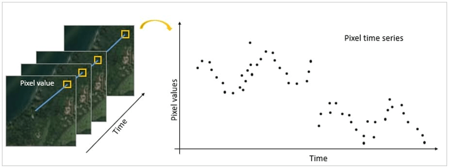
Combining Images Over Time
When many satellite images are available from different times, they can be combined to make a clearer map. Two main methods are used:
Temporal Aggregation: This method takes averages or middle values from multiple images to create one clear picture. For example, using the middle value of each spot over a year removes clouds and gives a better view of the land. This approach is fast and works well.
Time Series Composition: This method uses all clear images from a specific time, sometimes over several years. It can show changes but may be less accurate if the images come from different seasons.
Figure 5: Time series imagery illustration (Source: ESRI)
Both methods are valuable, but temporal aggregation is often preferred because it is simpler and quicker.
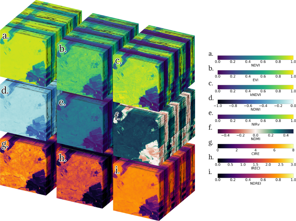
Enhancing Precision with Spectral Indices
Satellites record different colors of light, including some invisible to our eyes. By combining these colors, scientists create spectral indices, which highlight specific features on the ground. Examples include:
Normalized Difference Vegetation Index (NDVI): This measures plant health using green and near-infrared light, helping to identify forests, crops, and grasslands.
Normalized Difference Water Index (NDWI): This uses green and near-infrared light to locate water, like rivers or lakes, without confusion from plants.
Normalized Difference Built-up Index (NDBI): This uses near-infrared and shortwave infrared light to find cities, where buildings reflect more light.
Bare Soil Index (BSI): This identifies areas with little vegetation, such as empty fields or deserts.
These tools, combined with other satellite data, improve map accuracy. For instance, adding heat information can increase precision by 5-6%, aiding in finding water or wet soil.ation accuracy. For instance, incorporating the thermal infrared (TIRS) band may improve precision by 5-6%, aiding in the detection of water bodies and soil moisture.
Figure 6: A standardize catalogue of spectral indices (Source: Nature)
Why These Maps Are Useful
Land cover maps have many practical uses:
Farming and City Planning: They guide decisions about where to plant crops or build homes, ensuring resources are used wisely.
Weather Forecasting: They help predict weather by showing how land affects the air above it. For example, forests cool the air, while cities warm it.
Environmental Protection: They track issues like deforestation or soil loss, especially in places like Ethiopia or Central Asia, where land is changing fast.
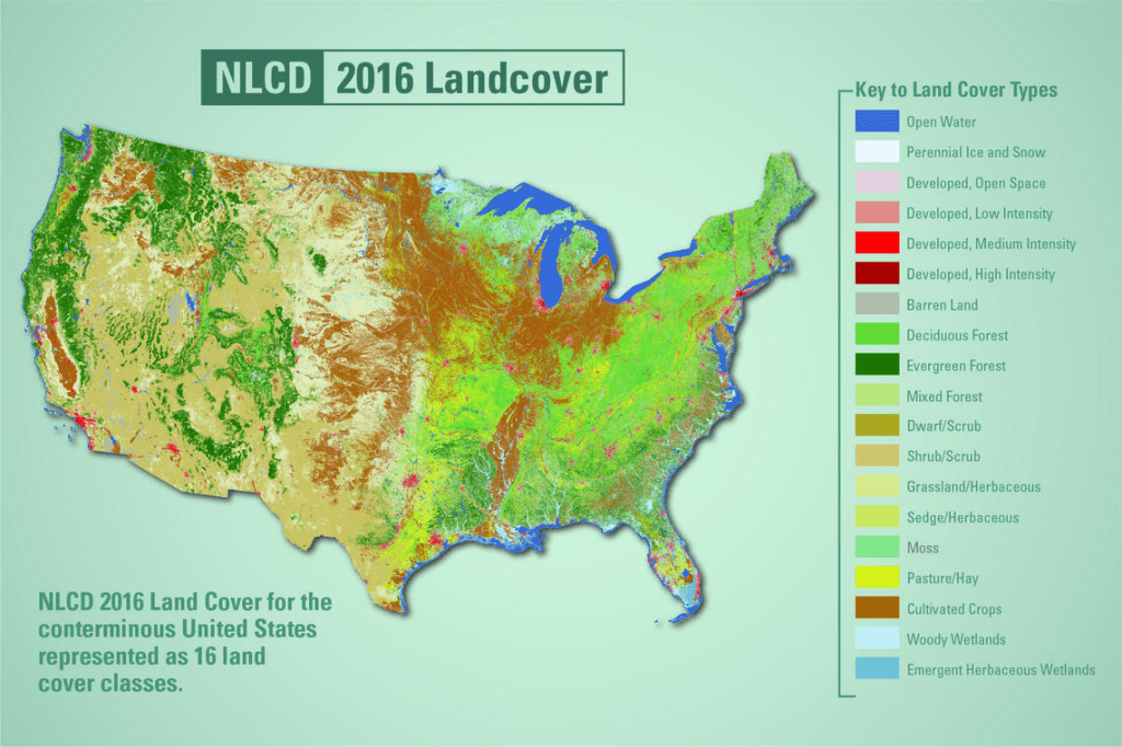
Figure 7: 2016 Land cover map for the U.S.
Conclusion
With tools like Google Earth Engine and classifiers like Random Forest, mapping the Earth’s surface has become faster and more accurate. These technologies allow anyone—from scientists to learners—to explore our planet using satellite images and powerful computers. Whether you care about nature or planning for the future, these tools are free and easy to use. Let’s try them and discover more about our world!
Thanks for reading! Now it is time to deepen your skills by enrolling in my Udemy course, “Land Cover Classification in Google Earth Engine” and start creating your own land cover maps with confidence!
In some cases, we may need to transfer the pixel values of our raster data to corresponding points and use them as attribute information. In this blog post, I will explain how to do it in GIS environment. There are two cases. First; we may create points corresponding to each raster pixel. Second; we may already have point data for specific locations. We will touch on both cases.
This content is taken from my Udemy course, “Raster Data Processing and Analysis in ArcGIS Pro”. You can access the course via the link.
Points Corresponding to Each Raster Pixel
First, let’s create points that correspond to each raster pixel. For this, we use the Raster to Point tool.
Fig. 1: Raster to Point tool in ArcGIS ProFig. 2: Result map
The points corresponding to each pixel are generated and the height values are stored in a separate column in the attribute table.
Fig. 3: The height values are shown in the column named “grid_code” in the attribute tabel of the point data
We Have Point Data
In the other option, we already have point data or we will create random points and transfer the height values corresponding to them. For this, we need to use theExtract Values to Pointstool. However, we do not have point data, so let’s create random points with the Create Random Pointstool.
Fig. 4: Create Random Points tool
After entering the name of the point layer, it asks us to select a vector data in the Constraining Feature Class section. The area where the points will be created will be limited using this selected vector data.
The number of points to be created is up to us.
Finally, we can choose the minimum distance we allow between two points to be created. In other words, if we choose 10 meters here, the distance between two points created cannot be less than 10 meters.
Fig. 5: Random points are created
But in the attribute table of this point layer, there is no height information. To get the height values, we will use “Extract Values to Points” tool.
Fig. 6: “Extract Values to Points” tool
We can find the corresponding height values in the attribute table of the newly generated point data.
Map algebra is a method that allows raster data to be analyzed with mathematical and logical operations in geographic information systems (GIS). Developed by Dr. Dana Tomlin in the 1980s, this method offers a wide range of applications from topographic analysis to hydrological models, from ecological modeling to urban planning. Map algebra works by performing mathematical operations on each cell of raster data and can thus establish relationships between data layers. In Python, we can process raster data with libraries such as Rasterio and GDAL, and perform fast mathematical operations with NumPy. For example, flood risk analyses can be performed by combining a region’s elevation map with precipitation data. These analyses make significant contributions to areas such as environmental management, urban planning and disaster management. Map algebra simplifies data analysis and helps make more effective decisions.
Mathematical Operations with Raster Data
We said that the basis of map algebra is to perform mathematical operations with the values in each cell of raster data. In these mathematical operations, another raster data can be used, or a fixed value can be used. In this example, let’s perform mathematical operations using fixed values on DEM data. It is quite easy to perform mathematical operations with Python. First, let’s import the necessary libraries:
import numpy as np
import matplotlib.pyplot as plt

# Open raster data file
dem_path = '/content/drive/My Drive/Map_Algebra/DEM.tif'

with rasterio.open(dem_path) as src:
  dem = src.read(1)
  profile = src.profile

# Visualize the Digital Terrain Model
plt.figure(figsize=(10,8))
plt.imshow(dem, cmap='terrain')
plt.colorbar(label='Height (m)')
plt.title('DEM')
plt.show()
We specify a constant value to use in mathematical operations;
# Specify a constant value
constant = 10
Now we can add, subtract, multiply and divide using constant.
# Addition
addition = dem + constant

# Subtraction
subtraction = dem - constant

# Multiplication
multiplication = dem * constant

# Division
division = dem / constant
The results of these operations were recorded in the relevant variables. If we want to save them, first let’s specify the file path in our Drive;
# Save the results
output_path = '/content/drive/My Drive/Map_Algebra/'
Now we will write the necessary code to save each result map to our Drive using this file path;
with rasterio.open(output_path + 'addition.tif', 'w', **profile) as dst:
  dst.write(addition, 1)

with rasterio.open(output_path + 'subtraction.tif', 'w', **profile) as dst:
  dst.write(subtraction, 1)

with rasterio.open(output_path + 'multiplication.tif', 'w', **profile) as dst:
  dst.write(multiplication, 1)

with rasterio.open(output_path + 'division.tif', 'w', **profile) as dst:
  dst.write(division, 1)
Let’s visualize one of the result data as an example;
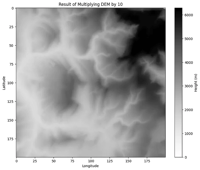
# Visualize the result of multiplication
plt.figure(figsize=(10,8))
plt.imshow(multiplication, cmap='Grays')
plt.colorbar(label='Height (m)')
plt.title('Result of Multiplying DEM by 10')
plt.xlabel('Longitude')
plt.ylabel('Latitude')
plt.show()
When we compare the legends of these data, we will see the difference. Each pixel value is multiplied by 10.
Logical Operations
Conditional expressions allow making decisions and classifying data based on specific criteria. In Map Algebra, these expressions are applied to raster data to obtain analytical results.
Conditional expressions check whether a cell meets a specific criterion. For example, in elevation data, we can determine cells that are greater than a certain threshold value. We can also use more complex expressions, such as selecting pixels where the elevation is greater than “this” degree and the slope is less than “this” degree, that is, meeting two or more criteria, but let’s keep the example simple and use only the elevation criterion. In this example, we will indicate pixels where the elevation is greater than 300 meters with 1 and pixels where it is less than 300 meters with 0.
First, let’s import numpy;
import numpy as np
We will need rasterio as well, but we already imported that. Additionally, we already opened the raster data file so we will not repeat it. Let’s switch to condition section;
# Conditional expression: Cells with height > 300 are 1, others are 0
conditional_raster = np.where(dem > 300, 1, 0)

# Visualize conditional raster data with Matplotlib
plt.figure(figsize=(10,8))
plt.imshow(conditional_raster, cmap='gray')
plt.colorbar(label='Height (m)')
plt.title('Areas with an altitude greater than 300 meters')
plt.xlabel('Longitude')
plt.ylabel('Latitude')
plt.show()