Land use changes, which mostly occur due to anthropogenic effects in urban areas, cause many problems such as urban heat islands and floods. In combating these problems, data on impervious surfaces and green spaces, which are two important components of urban areas, play a critical role. Some datasets such as CORINE Land Cover, Urban Atlas Dataset, Trust for Public Land’s ParkServe Dataset include these data. However, these datasets are not sufficient in terms of resolution and/or completeness. Kuang et al. (2021) prepared a global dataset showing impervious surfaces and green areas as an alternative to these datasets. The methodology used in this study is as follows;
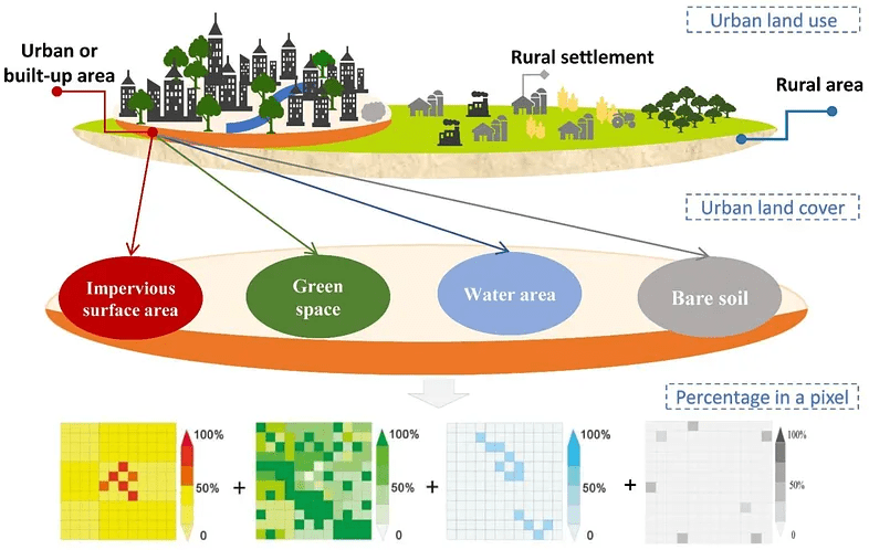
Basically, the researchers want to map two main parts of cities:
- Impervious Surface Area (ISA): Areas like concrete roads, buildings, and parking lots that don’t let water soak into the ground.
- Green Space (GS): Areas with vegetation, like trees, grass, or gardens.
The Big Idea: Hierarchical Architecture Principle and Subpixel Method
In the study, it is assumed that urban areas consist mainly of impervious surfaces, green spaces, water surfaces and bare soils. However, satellite images with medium spatial resolution such as Landsat can show more than one land cover type in the same pixel. For this reason, the study proposes the sub-pixel method. With this method, the percentage of each relevant land cover type in each Landsat pixel is calculated. For this, very high resolution images are used. After some of the pixels are trained in this way, the land use rates in other pixels can also be estimated using Machine Learning.
However, when doing this in global scale, it is necessary to analyze similar patterns separately to be able to get more accurate results. Thus, global terrestrial surface was divided into 15 ecoregions and these were analyzed separately.
Mapping Impervious Surface Areas
Impervious surfaces are human-made surfaces that don’t let water soak into the ground, like roads, buildings, parking lots, and sidewalks. Mapping ISA means figuring out how much of each 30m x 30m piece (pixel) of a city is covered by these surfaces, expressed as a percentage (e.g., 70% concrete). This is important for understanding urban growth, managing floods (since water runs off ISA), and planning greener cities.
The foundation for ISA mapping is the Normalized Settlement Density Index (NSDI), which estimates the percentage of impervious surfaces in each pixel. They calculate NSDI, a number from 0 to 1 (e.g., 0.7 = 70% concrete), for every 30m pixel globally. They did this by following data sources;
Data Sources:
• Landsat 8 OLI images (30m resolution): Provide detailed views of land cover.
• SRTM Digital Elevation Model (DEM): Shows terrain to account for hills or flat land.
• DMSP/OLS Nighttime Lights: Highlights urban areas that glow at night.
• Global Surface Water: Excludes water bodies to avoid confusion with concrete.
• Enhanced Bare Soil Index (EBSI): Separates bare soil from ISA, especially in dry areas.
The researchers selected 300 random points in urban areas from 57 cities across 15 regions and they created 90m x 90m grids around each. By using Google Earth (0.6m) and Gaofen-2 (GF-2) (1m/4m) images, they manually marked impervious surfaces (roads, buildings) in each grid, calculating the ISA percentage (e.g., 60% concrete).

They feed the data (Landsat bands, DEM, nighttime lights, etc.) and training samples into the Random Forest algorithm on Google Earth Engine. RF learns patterns (e.g., “Bright, non-green areas with lights are concrete”) and predicts the ISA percentage (NSDI) for every pixel. They chose RF because it is more accurate than other methods like support vector machines for urban mapping.
Retrieval of Urban-Rural Boundaries
The researchers used the Normalized Settlement Density Index (NSDI), which shows how much concrete is in each 30m x 30m pixel (e.g., NSDI = 0.7 means 70% concrete) to identify urban-rural boundaries. By setting a threshold for NSDI, they decide which pixels are urban (lots of concrete) vs. rural (less concrete). They also refined these boundaries to make them accurate and smooth. They decided what NSDI value marks a pixel as “urban.” A higher NSDI means more concrete, so urban areas have higher NSDI than rural ones. But cities look different around the world (e.g., dense in Africa, sprawling in the USA), so it is necessary to use different thresholds for different regions.
They tested NSDI thresholds from 25% to 60% (in 5% steps, e.g., 25%, 30%, 35%) in 57 sample cities across the 15 ecoregions and for each city, they check how accurate the boundary is by using Overall Accuracy and Kappa Coefficient. They picked the best threshold values for each region based on the accuracy assessment results.
They converted the NSDI map from raster to a “vector” format (shapes or polygons) where pixels with NSDI above the threshold are grouped into urban areas. For example, in Africa, all pixels with NSDI ≥ 0.35 are marked urban and connected to form a city shape. Some urban areas have “holes” (pixels with low NSDI, like a park inside a city). They filled these holes to create smooth, solid urban regions.
Finally, they double-checked the boundaries by hand to fix mistakes.
Mapping Green Spaces
FVC is a way to measure how green a pixel is based on NDVI. To calculate FVC, this formula was used;
FVC = (NDVI of the pixel — NDVI of bare soil) / (NDVI of pure vegetation — NDVI of bare soil)
• NDVI of the pixel: How green this specific pixel is (from satellite data).
• NDVI of bare soil: How green a place with no plants is (like a desert).
• NDVI of pure vegetation: How green a place with only plants is (like a forest).
Later, Normalized Green Space Index was calculated by multiplying FVC values with β. β is a correction factor they calculate for each region (e.g., North America or Africa) to make sure the greenery percentage is accurate. Think of β as a knob you tweak to adjust the “greenness” measurement so it matches the real world, because plants look different in different places (e.g., a desert vs. a rainforest).
FVC is calculated using the Normalized Difference Vegetation Index (NDVI), which measures how much plants reflect light. But FVC isn’t perfect — it’s like a rough guess of how much greenery is in a pixel. Different regions (e.g., North America, Africa, or Asia) have different types of plants, climates, or soils, which can make FVC over- or underestimate the actual green space.
For example:
• In a lush forest city, FVC might say 50% greenery, but the real green space is 60%. β boosts the number.
• In a dry desert city, FVC might overestimate greenery because sparse plants look greener than they are. β lowers the number.
The researchers compared the FVC (rough guess) to the actual green space percentage in the training data (which they digitized and calculated fractions). For example, FVC might say 40% greenery, but the sample shows 48%.
They plotted FVC against the actual green space percentages from the samples. This creates a graph where:
• X-axis: FVC values (e.g., 0.4, 0.5).
• Y-axis: Actual green space percentages (e.g., 48%, 60%).
• They draw a line of best fit through the points. The slope of this line is β.
It’s a number that shows how much FVC needs to be scaled to match the real green space. If β = 1.2, it means FVC is too low, so you multiply FVC by 1.2 to get the right number. If β = 0.8, FVC is too high, so you reduce it. For each ecoregion, they used the sample cities in that region to find the best β. For example:
• In a tropical ecoregion with dense jungles, β might be higher because FVC underestimates thick vegetation.
• In a desert ecoregion with sparse shrubs, β might be lower because FVC overestimates greenery.
Once they have β for an ecoregion, they multiply the FVC of every pixel in that region by β to get the final NGSI.

Conclusion
As a result of the accuracy assessment of the results, produced within the scope of the study, it was stated that they have high accuracy (>90%). Since most of the studies in the literature focus on specific cities and regions, the production of impervious surface and green space maps on a global scale is quite important. However, the need for very high-resolution satellite images may limit the applicability of the study. The maps produced as a result of the study can be used as input maps in environmental, climate and urban planning studies and can be quite useful.

Leave a comment